Nation’s Service-Employment-Redevelopment Network Introduces Sleek, Forward-Moving Logo That Symbolizes Organization’s Path Into a New Era
Ignacio Salazar, SER National President and Chief Executive Officer, announced a branding campaign that promises to catapult the organization’s transformation into the next five years and beyond as part of a new phase in its 58-year history.
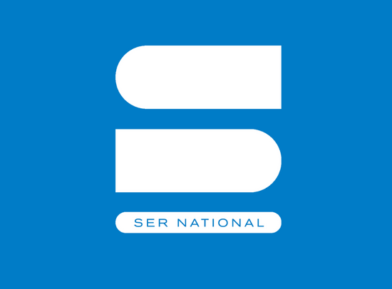
“SER National is extremely proud to present a new branding feel and look that captures our journey into tomorrow with an exciting visually moving symbol of three parallel bars and our iconic SER name above them projecting a powerful, unified message through the genius of their simplicity,” says Salazar. “This design resulted from significant, diverse input from many stakeholders, including staff, board members, and sponsors who shared their vision for the future of SER National and our vast SER Network of Affiliates. Out of this very deliberate process, and with the guidance of the nationally renowned ISP Creative design team, evolved a concept that acknowledges our origins, the growth of SER, blazing our path in the decades since then, and point to the unlimited potential ahead. Best of all, the unveiling of our new branding coincides with the completion of an ambitious 5-year strategic plan,” says Salazar.
ISP Creative’s first goal was to create a symbol for SER National that would be instantly recognizable. “Our minds can capture visual messages an amazing 60,000 times faster than even words,” says Dan Craig, ISP Creative Director. “The sole purpose of a logo is to establish recognition for an organization; one image so readily identifiable with your team becomes as unique as your face or signature to those who know you and other individuals you meet. The other benefit of a new branding symbol is that it says SER National is moving forward, as is the vital role of the SER Network of Affiliates throughout the nation and in Puerto Rico. Plus, a successful logo can be used cross-functionally on all platforms and still carry the same impact. Achieve these objectives, and a symbol takes on a life of its own that reinforces the strength of SER National,” adds Craig.
Salazar says the re-branding will be used throughout all programs, emphasizing their unique but coordinated relationship within the SER family. “I am especially excited about how we are using a new color palette that speaks to our cultural diversity and celebrates that multi-community focus of our programs,” says Salazar. “In the coming days, weeks, and months, we look forward to sharing even deeper reasoning that led to the creation of this new visual identity. We invite our longtime friends and new visitors to visit our website and tour how all this ties together. The future at SER National is now!” says Salazar.
SER National Unveils New Branding Design That Projects Its Vision Into the Future
I am a SER senior. I’ve combed your entire website to find out what the abbreviation stands for.
Please reply.
Hello, SER stands for Service, Education, and Redevelopment. It’s under our About section on our webpage.